Here are the winners in today's American economic story:
- the Northeast;
- the Upper Midwest;
- the Pacific Northwest;
- the California coast;
- (Greater) Denver;
- (Central) Texas;
- southern Florida.
These regions have better health, they produce new ideas, they are tackling our energy challenges, and they have that potent double fuel -- higher education levels and the higher incomes that always walk hand in hand.
Now, of course, there are other observations to make about the patterns that emerge on these maps:
- Education levels should be correlated to both income levels and the creation of new ideas (as represented by patents), and the maps seem to tell us that, so we are not surprised. (Whether patents and income should be correlated is an interesting other question.)
- While it's interesting that per capita energy usage in New York State is the lowest in the whole country, it must in part be explained by the high densities of New York City and the efficiencies that such densities allow -- like a very strong public transit system. Meanwhile, the high per capita energy consumption in the Plain states must have something to do with the energy intensity of modern agribusiness, especially in areas of relatively low population. Nevertheless, it is interesting that the whole Northeast is very energy efficient, even though the winter months require significant heating of buildings. This can only occur where attitudes, practices and policies (and politics) align to encourage energy efficiency.
* * * * *
Map 1: Male Mortality, by county
Darker = Men live longer.

(Source: Moretti, 2011)
* * * * *
Map 2 = Patents
Darker = More patents.

(Source: Moretti, 2011)
* * * * *
Map 3: Per Capita Energy Consumption (2009)
Blue = lower per capita consumption; yellow = higher per capita consumption.
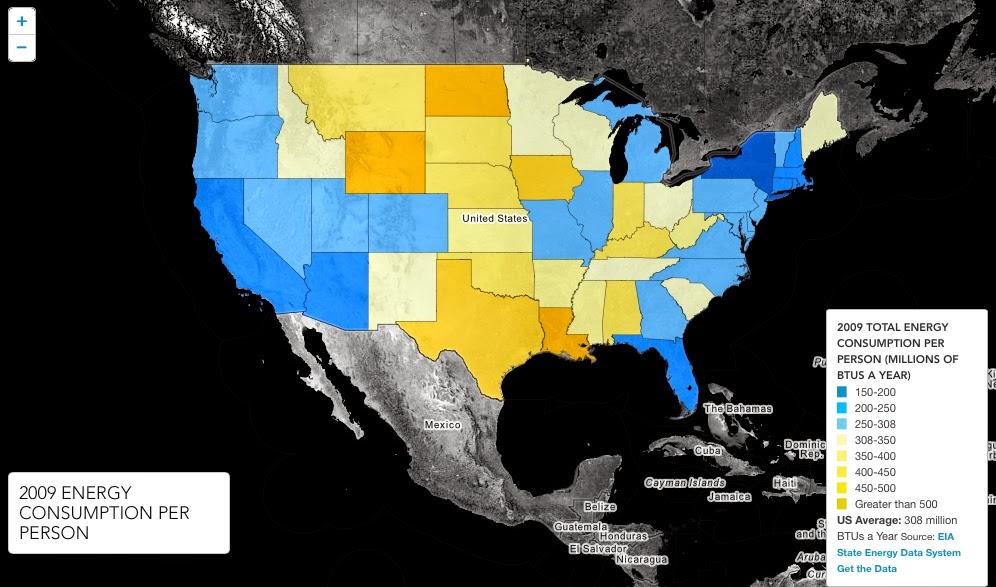
(Source: Energy.gov)
* * * * *
Map 4: Education Level
Blue = highest; green = mid; yellow = least.
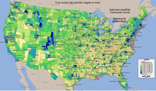
(Source: American Community Survey)
* * * * *
Map 5: Median Household Income
Green = wealthier; Orange/Brown = poorer.

(Source: ArcGIS.com)
* * * * *
Map 6: How Americans voted in 2012
Blue = Democratic; Red = Republican.

(Source: Ray Grumney, startribune.com)